Trademax Repositioning
Art Direction
The positioning of Home Furnishing Nordic's three main companies started to resemble each other too closely. It became challenging to discern Trademax's USP in the market. While traditionally the company focused on product and price, over the years, there has been a shift toward a more sophisticated and exclusive approach in both communication and visuals. It was time to clarify Trademax's position in the market and return to a positioning that emphasized product and price more.
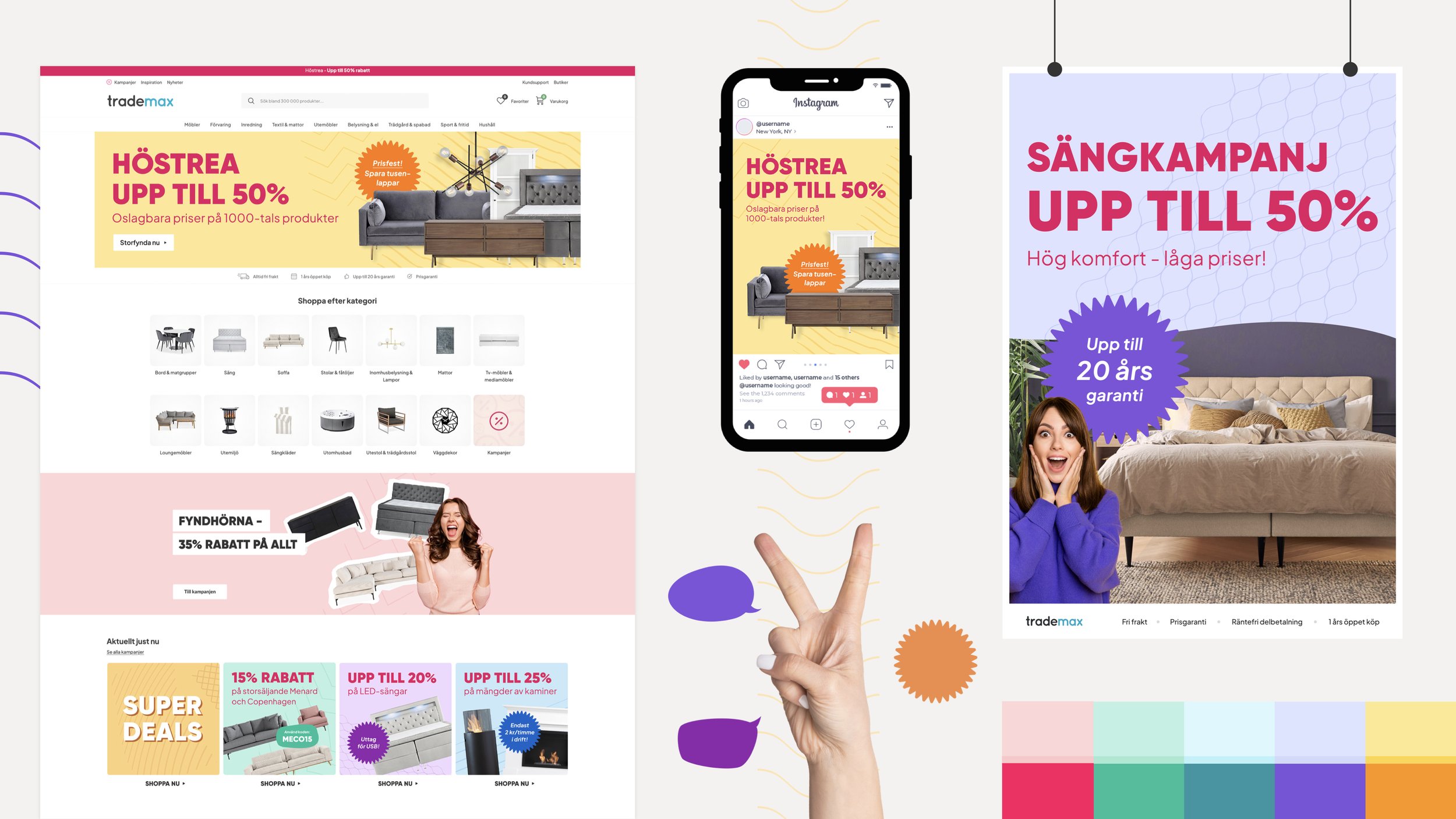
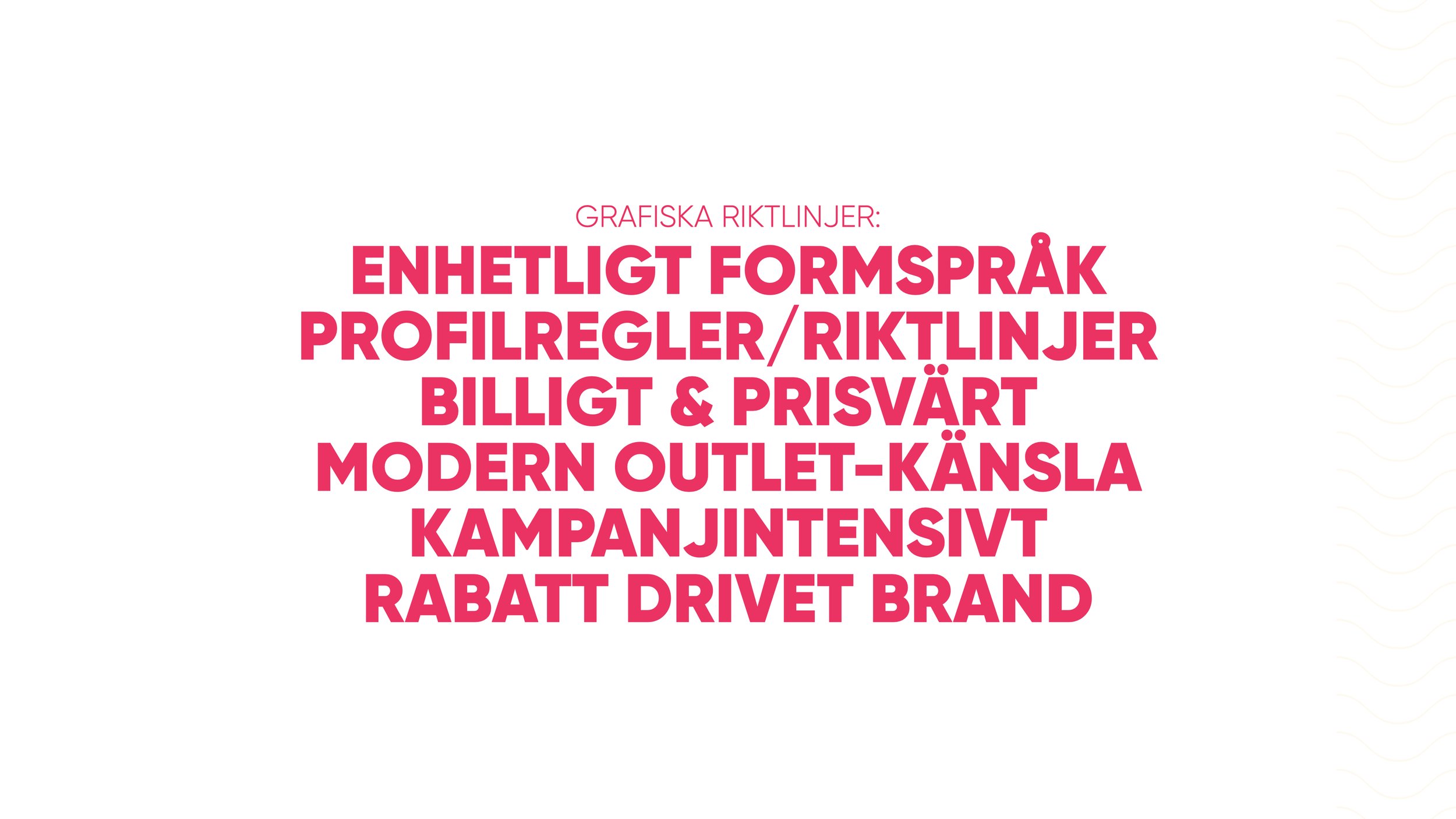
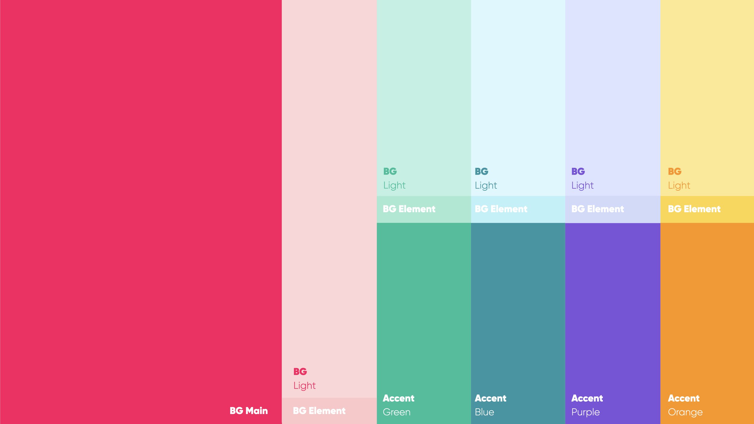
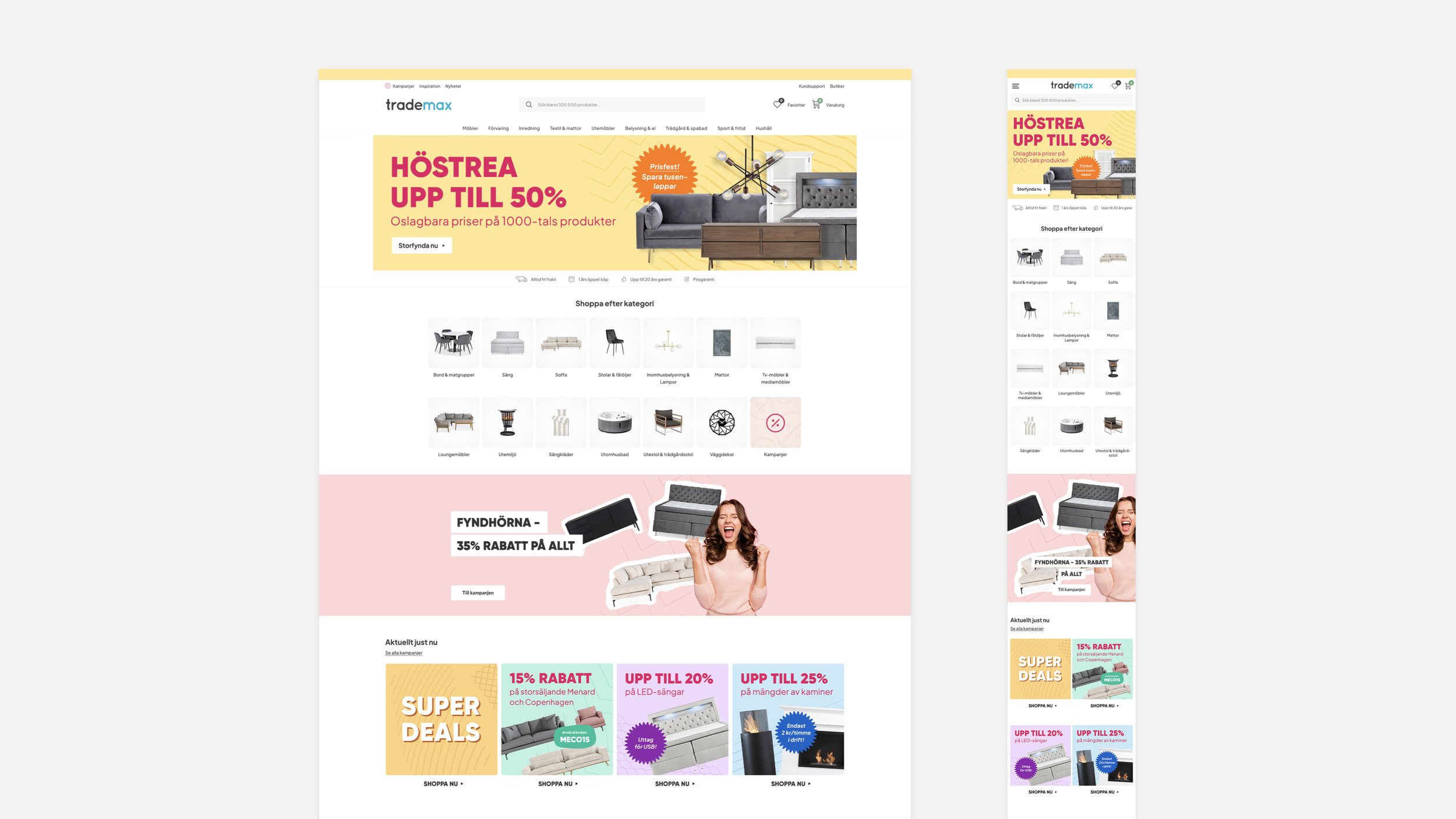
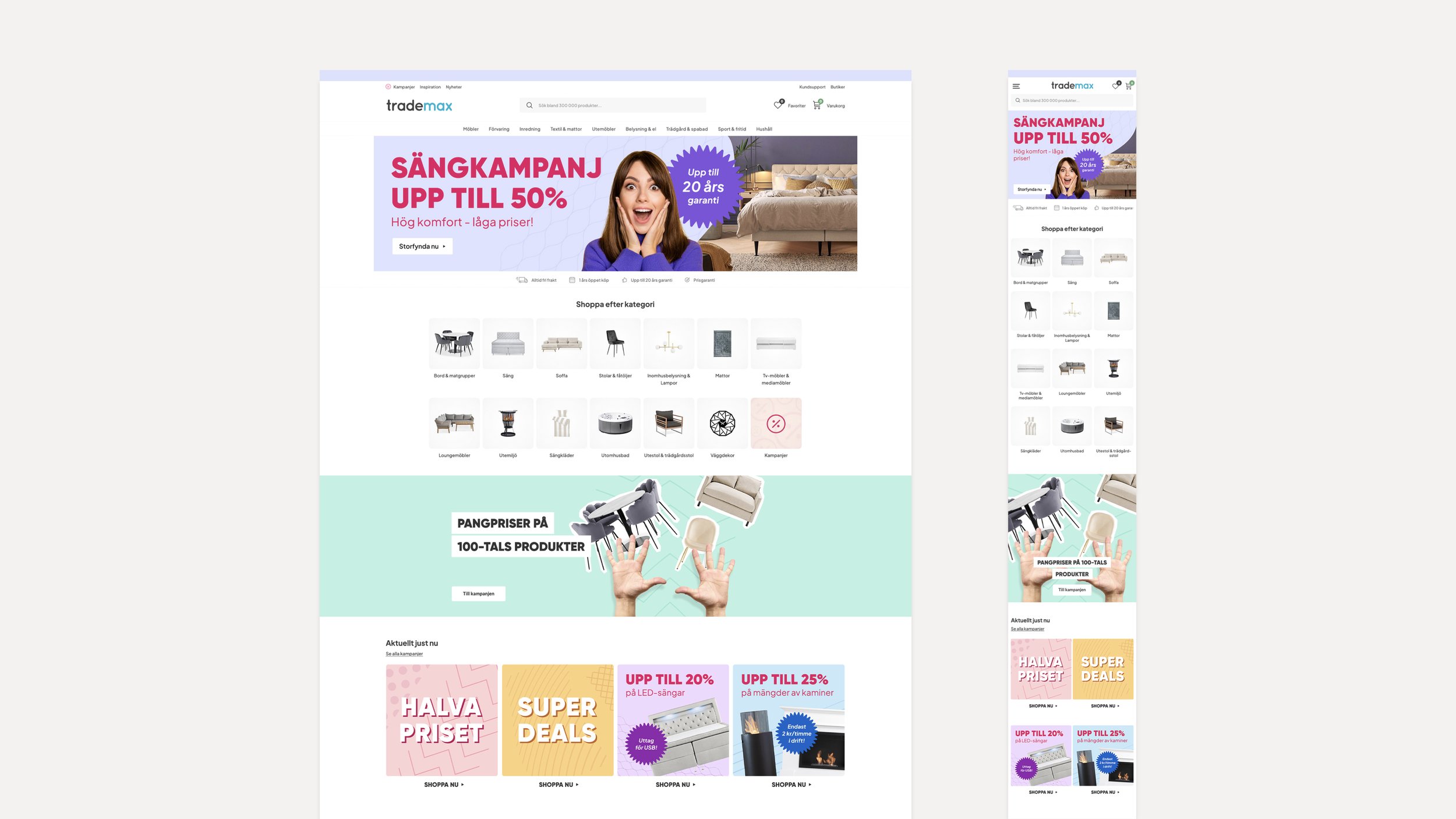
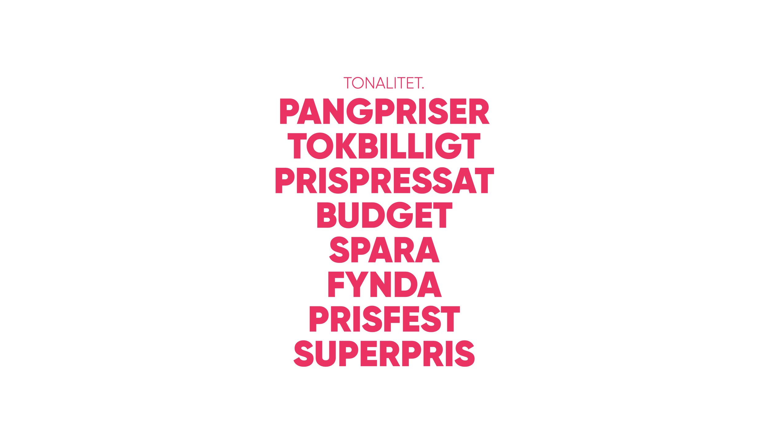
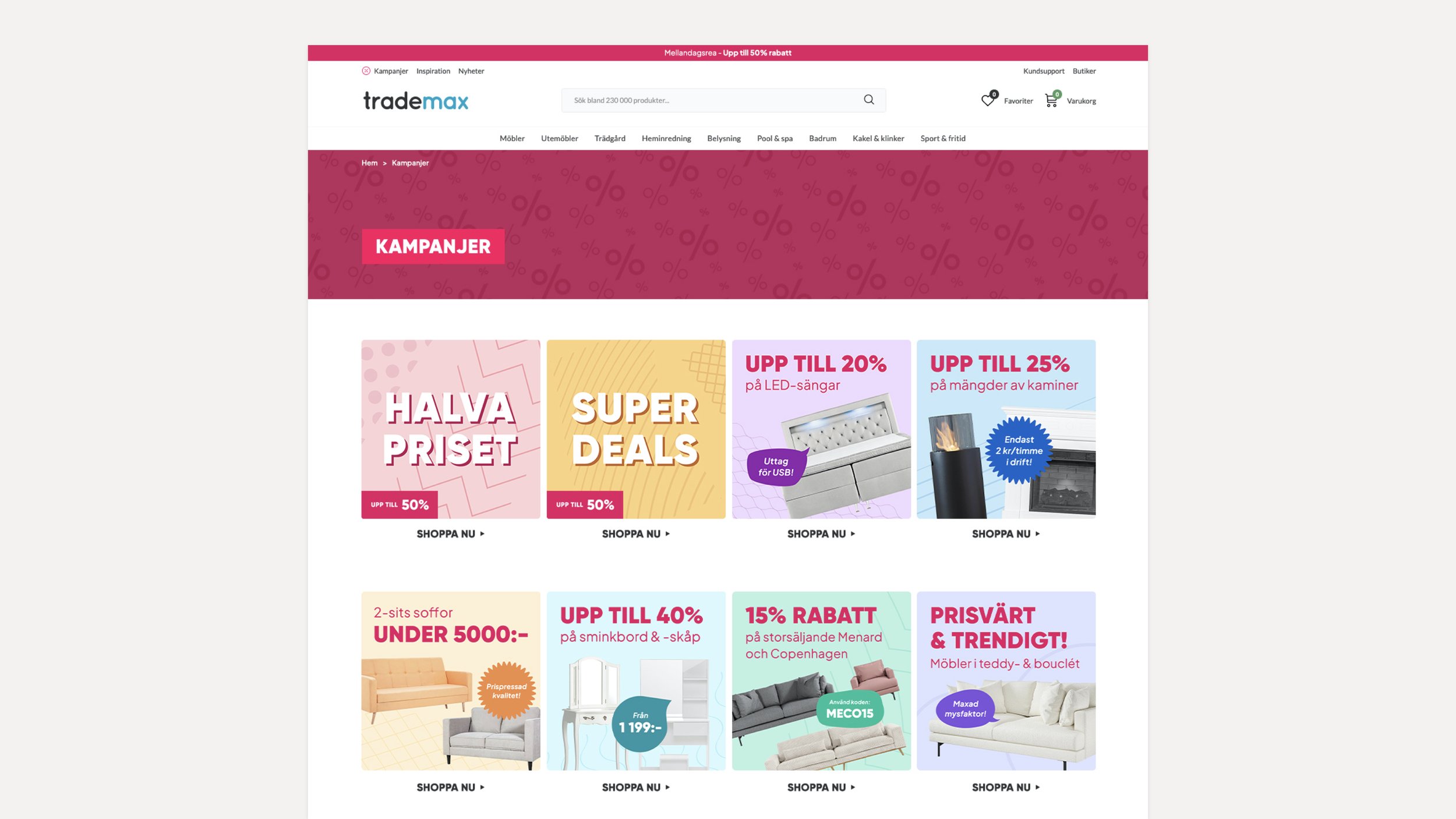
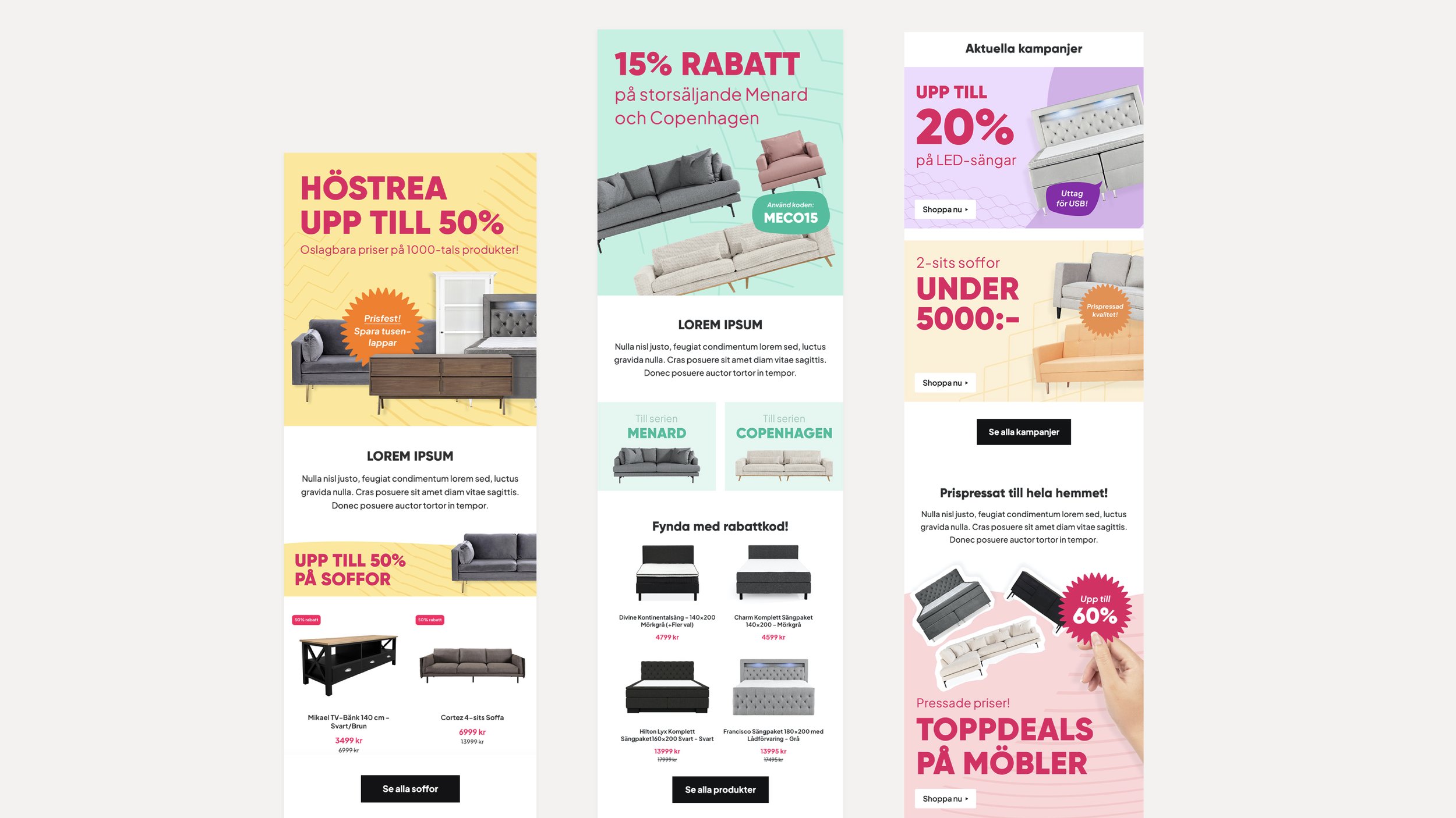
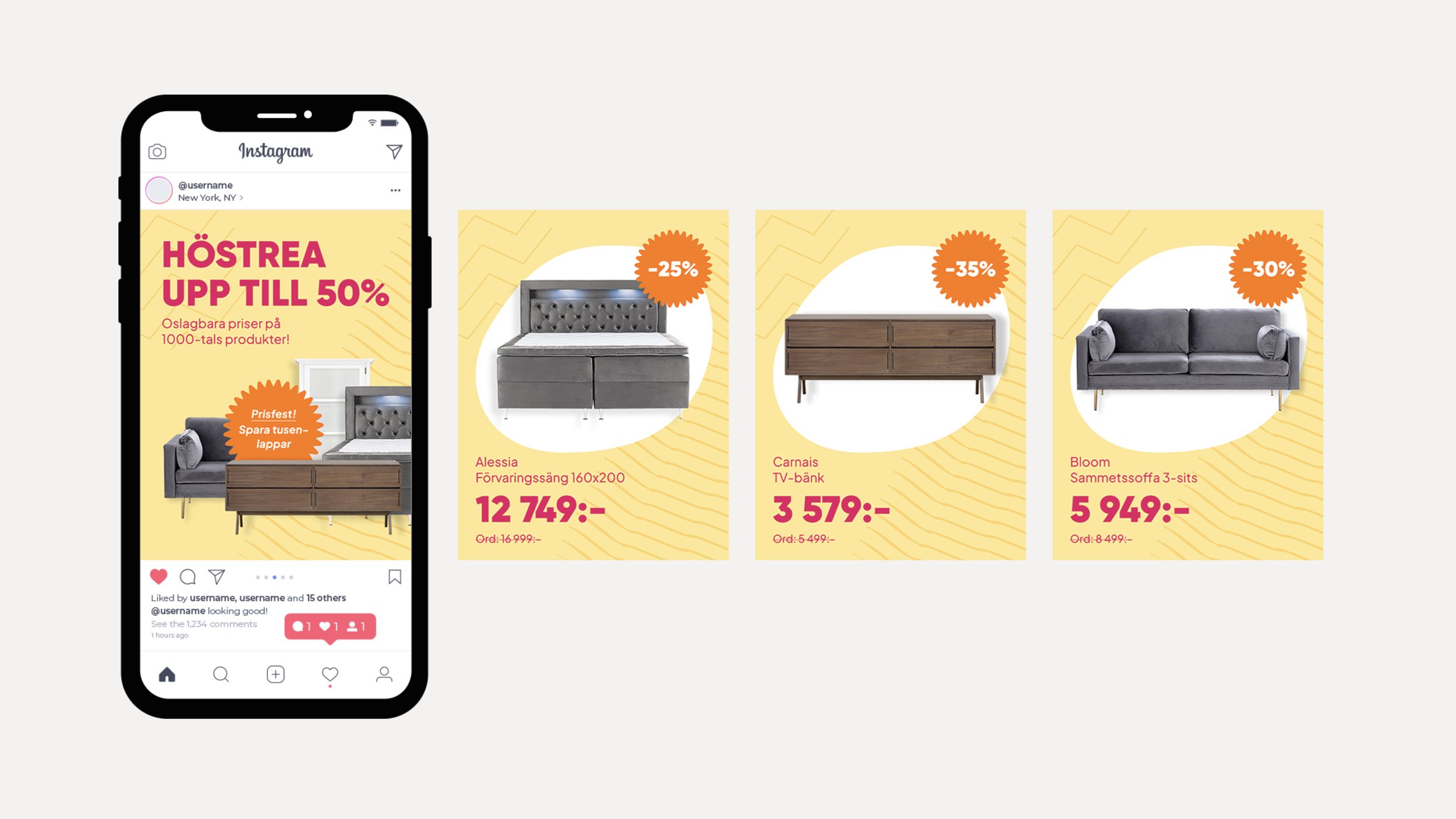
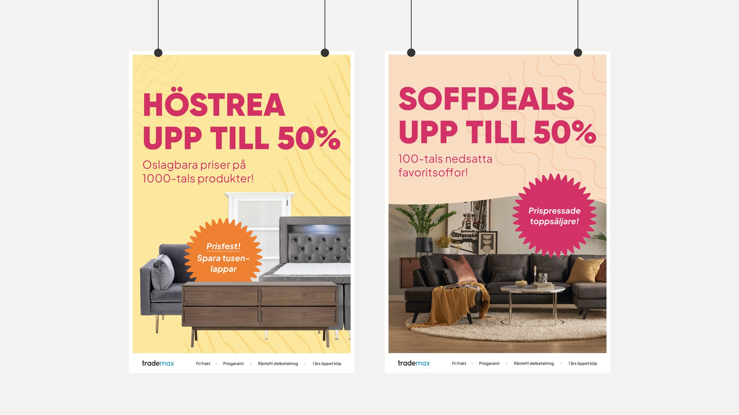
The visual design aesthetics and tone of voice developed resulted in a more vibrant, aggressive, and expressive approach. The focus was on maintaining magenta as the brand's signature color in all headline typography while also adopting a more aggressive tonality. This was done to promote Trademax as a company where great deals can always be found. This initiative aims to create a distinct market position for Trademax, emphasizing its commitment to value, variety, and being a family-friendly brand.
